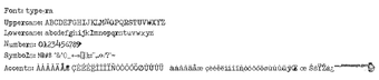
Distressed typewriter display font for vintage designs
Type-Ra renders a battered, typewriter-inspired display look with distorted edges and a diffused-ink effect, suitable for large headers and decorative text. Designed by Juha Korhonen, the font installs as a standard TrueType file and works in any application that uses system fonts. It targets graphic designers and hobbyists who need a gritty, worn print texture for posters, zine covers, band flyers, or social graphics.
What the font changes about headline typography
Type-Ra shifts clean display text into a weathered, mechanical voice by applying eroded contours and an uneven ink appearance to each glyph. Its high-impact style is intended for display sizes rather than body text, and the visual effect reproduces worn letterpress or a degraded ribbon rather than precise, uniform strokes.
How much control designers get over character coverage
Type-Ra supplies an unusually large glyph set, with 653 glyphs and 177 unique characters that span Latin, Greek, and Cyrillic ranges. That breadth lets designers set multilingual headlines without substituting fallback faces. Because it ships as a TrueType Font, designers control weight and size through application type controls rather than bundled variable axes.
How it fits into a typical workflow and its installation
Installation and use integrate with standard desktop tools: the package provides a TTF file you install by right-clicking and selecting Install, after which the font appears in Microsoft Office, Adobe Creative Cloud, and other system-aware editors. The font targets decorative use, so include it as a header layer or masked element rather than for running paragraphs.
Who should pick this font and one practical consideration
Type-Ra suits designers who want a gritty, era-specific headline texture and need extended language support, especially for posters or music graphics. Note that the font’s license restricts commercial use unless you obtain permission from the designer, so verify licensing before shipping client work. For best results, pair the font with a neutral body face and reserve it for display-scale treatments.